Monday, 10 May 2010

Tate Liverpool - DLA Piper Series - Sculpture

I really enjoyed this exhibition, not only does it contain a large amount (and a vast array) of work, it's also the way that the work has been curated that makes for such an interesting exhibition.

What was interesting for me was the idea of a 'frame' around work, whether it be an actual frame around a painting or drawing or just the physical limits of a sculpture, where does the work start and where does it finish? The reason this became of interest for me within this exhibition was because of the wall colour. When I first walked into the electric pink room (curated by Michael Craig-Martin) it was very hard for me to look around the room and pick out an individual piece of work, instead I could only seem to see the room as a whole. The pink acts almost like a bridge between the pieces, linking or merging one to another, the whole room becoming a single work of art rather than a collection of individual pieces.

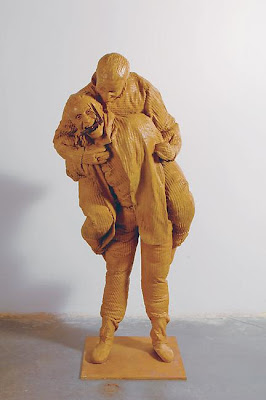
Another of the spaces really interested me as well, this being the 'disco space'. At first you enter into a small yellow room with headphones hanging on the wall, you then take your headphones and then enter through a curtain into a large, low-lit room with purple walls, whilst various dance music is played through your headphones. Immediately you are confronted by Ron Mueck's Ghost, 1998, which, in combination with the loud music playing in your headphones, is quite a scary and overwhelming experience. The room was also empty at the time I walked in, so when you combine that with your lack of sound from the room itself, it was really quite surreal. After a few moments you get your bearings and I really began to enjoy the experience. The sculptures just seem to fit really well within the context of the flashing dance floor, disco balls and loud music. It perhaps detracts from the meaning of the original piece but in that situation, again it was more about the curation of the room and bringing the pieces together as a whole.

These are a few of the pieces on show:

Ron Mueck, Ghost, 1998

Bridget Riley, Hesitate, 1964

Tony Cragg, Axehead, 1982

Jeff Koons, Three Ball Total Equilibrium Tank (Dr. J Silver Series), 1985


Eduardo Paolozzi, Michaelangelo's 'David'?, 1987


P, Manzoni, Artist's Breath, 1960

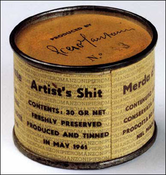
P, Manzoni, Artist's Shit, 1961

Franz West, Viennoiserie, 1998

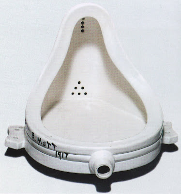
Marcel Duchamp, Fountain, 1917 rep. 1964

Pavel Buchler

Fly, 2009

I couldn't find an image of this piece so firstly... apologies for that. However, I was interested by the simplicity of this piece and it's effectiveness in drawing the viewer in. The piece is based around an 'exit' sign, which appears to have a fly trapped inside. Upon approaching the piece you hear this faint 'buzz' and immediately you feel compelled to get closer to the object, almost touching, in order to know whether you are hearing a real fly or not. I also liked the visible power leads, I'm not really certain why... it just seems to add a certain charm or something to the piece.

Nick Crowe and Ian Rawlinson

The Four Horsemen, 2009


I saw this piece in the Leeds City Gallery, as a part of the Northern Art Prize exhibition. I wasn't over excited by the actual work itself but more it's placement within the gallery. Upon entering, what is usually quite a 'traditional' space, you were confronted by a vast, white cube, from which a loud soundtrack could be heard. This just seemed quite surreal but really contrasted well with the other works on display in the room. I liked how white the walls were, very pure and again a stark contrast to the blue walls and gilded frames which occupy the space around the piece. Once inside the structure, the lighting was very bright, which really brought out the 'whiteness' of the walls. I wasn't so keen on the fact that you could see the power leads (although covered for health and safety reasons) and also the brackets, which were supporting the 4 television screens, they seemed to detract from the 'myth' of the piece, it no longer felt as if it had appeared in the room through some form of magic but in all i enjoyed the piece.

Tuesday, 2 February 2010

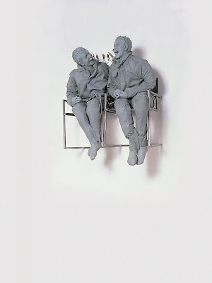
Juan Munoz


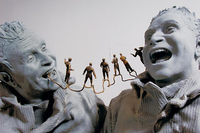
I've been a fan Munoz's work since I saw his retrospective at Tate Modern a year or so ago. I really like his figures, the seem to occupy a space between humor and horror. I don't quite know whether to laugh or run for my life for fear of their seemingly inevitable animation. Also items such as scissors and a knife, which are held within two of the pieces pictured above, also add to the air of uncertainty and to unsettling the viewer... or at least they do me anyway.

Gilles Barbier


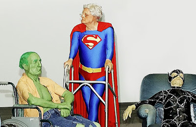
I really enjoy the morbid humor of this piece and I just like the idea of the 'super hero' having to face it's own mortality. They are meant to represent this idea of an invincible or unfaltering 'good' but yet they deteriorate like the rest of us.

This is just amazing.

Wim Delvoye


I came across a piece of Delvoye's work a while a go but it wasn't until today that I fully researched the artist. It's safe to say that I was pretty blown a way by his work. The 'completeness' of it really appealed to me, the body of work just feels well rounded, like he has considered every possibility of the work and then pushed it to it's limit. I also love the business like approach to the production of the 'Cloaca' series of work and that whole idea of the production line/factory idea within the art world. This approach is something that I feel will suite the subject matter of my current work really well and has already given me several ideas that I feel now are worthy of exploration.

http://www.wimdelvoye.be/